SAAS PLATFORM · E-COMMERCE · UI/UX DESIGN
Rebuilding a Complex Site Builder into a Clearer, More Scalable Editing System
Project overview
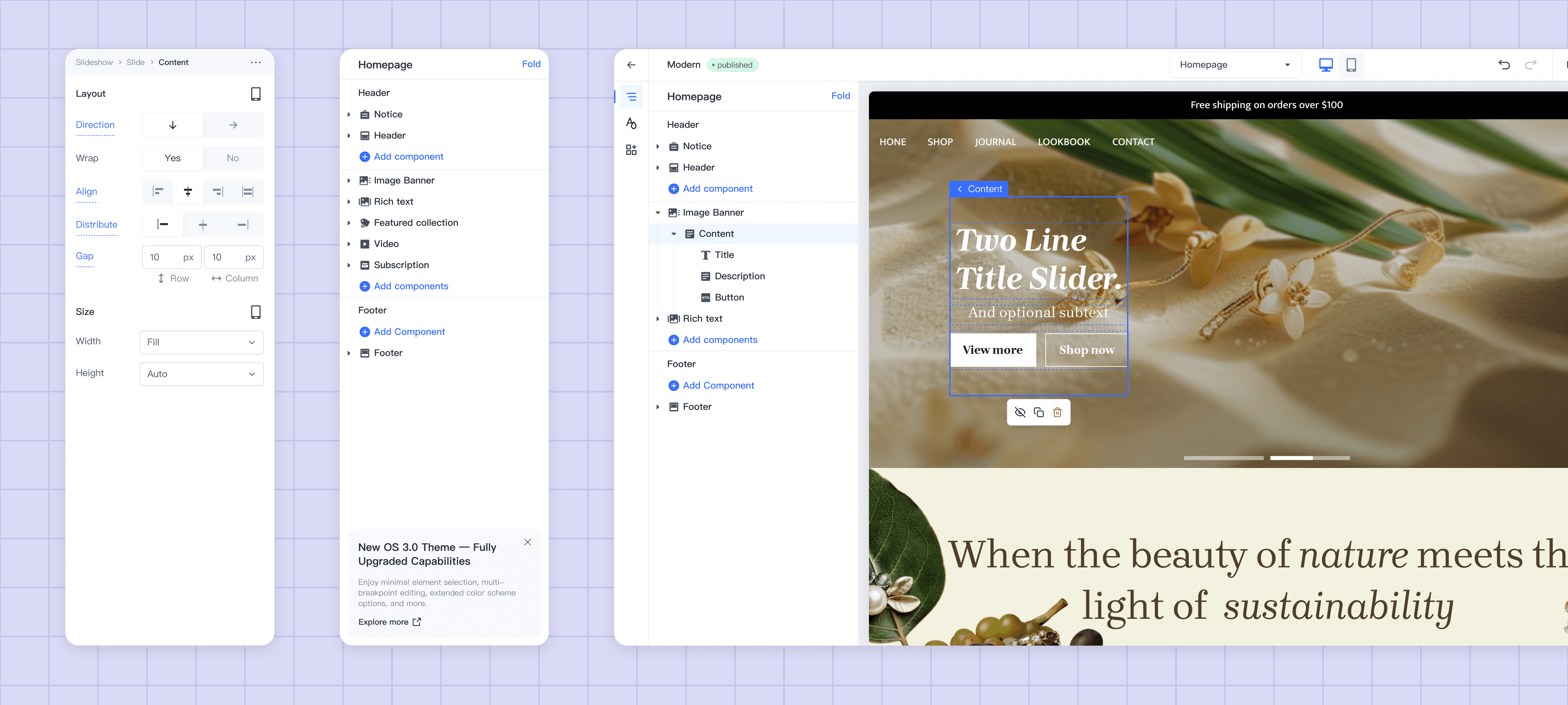
I redesigned the underlying editing experience for an enterprise commerce site builder—clarifying hierarchy, enabling modular composition, and establishing reusable patterns for responsive configuration and user guidance.
Tools
Figma
Trello
Trello
Trello
Scope of Work
The Challenge
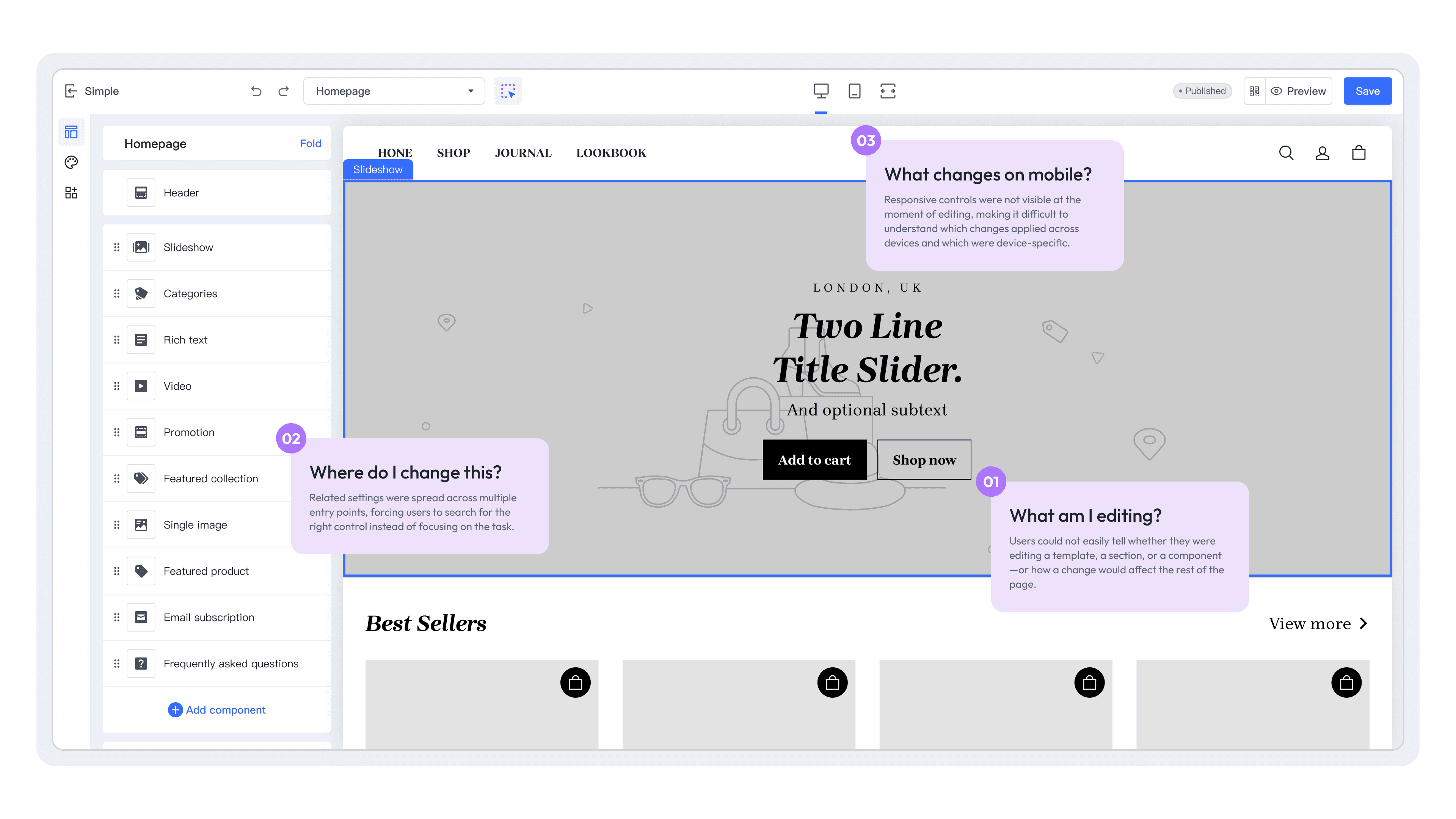
The Site Builder was a core workspace for merchants shaping their online storefronts. As the product evolved, configuration options became scattered, the relationship between templates, sections, and components became harder to understand, and responsive editing introduced another layer of decisions.
The challenge was not simply to improve individual screens. It was to create a clearer editing model that could support both new users learning the product and experienced users needing flexibility and control.
Why it was complex
The redesign had to balance several interconnected needs:
A layered editing model — users needed to understand what they were editing, where it lived, and how it related to other elements.
Flexible composition — the experience had to support a wide range of storefront structures without turning every task into a bespoke workflow.
Responsive configuration — desktop and mobile behaviors needed to be clear without duplicating the entire editing experience.
Discoverability and guidance — users needed timely support without persistent guidance getting in the way of experienced users.
A maintainable foundation — interaction patterns and configuration capabilities needed to be reusable across the product, rather than solved screen by screen.
The goal was to turn a growing set of capabilities into a coherent editing system—one that product and engineering teams could evolve over time.

The strategic shift: from fragmented editing to modular composition
I reframed the editor around a simpler principle: users should be able to understand and assemble the smallest meaningful building blocks, rather than navigate through loosely connected configuration areas.
This meant clarifying the relationship between editing units, defining how they could be composed, and making configuration behavior more consistent across the experience.
Instead of treating each customization request as a separate UI problem, I focused on creating a model that could support many page structures, styling needs, and future capabilities through a shared set of rules.
The system


1. A clearer editing hierarchy
I defined a more understandable structure for templates, sections, and components so users could see what they were editing and how changes affected the broader page.

2. Reusable configuration patterns
I established consistent patterns for common configuration needs—such as content, styling, layout, and responsive behavior—so capabilities could scale without introducing a different interaction model each time.

3. Responsive editing as a first-class behavior
Rather than treating mobile as an afterthought, the experience made responsive decisions visible within the editing model, supporting device-specific adjustments where they were needed.
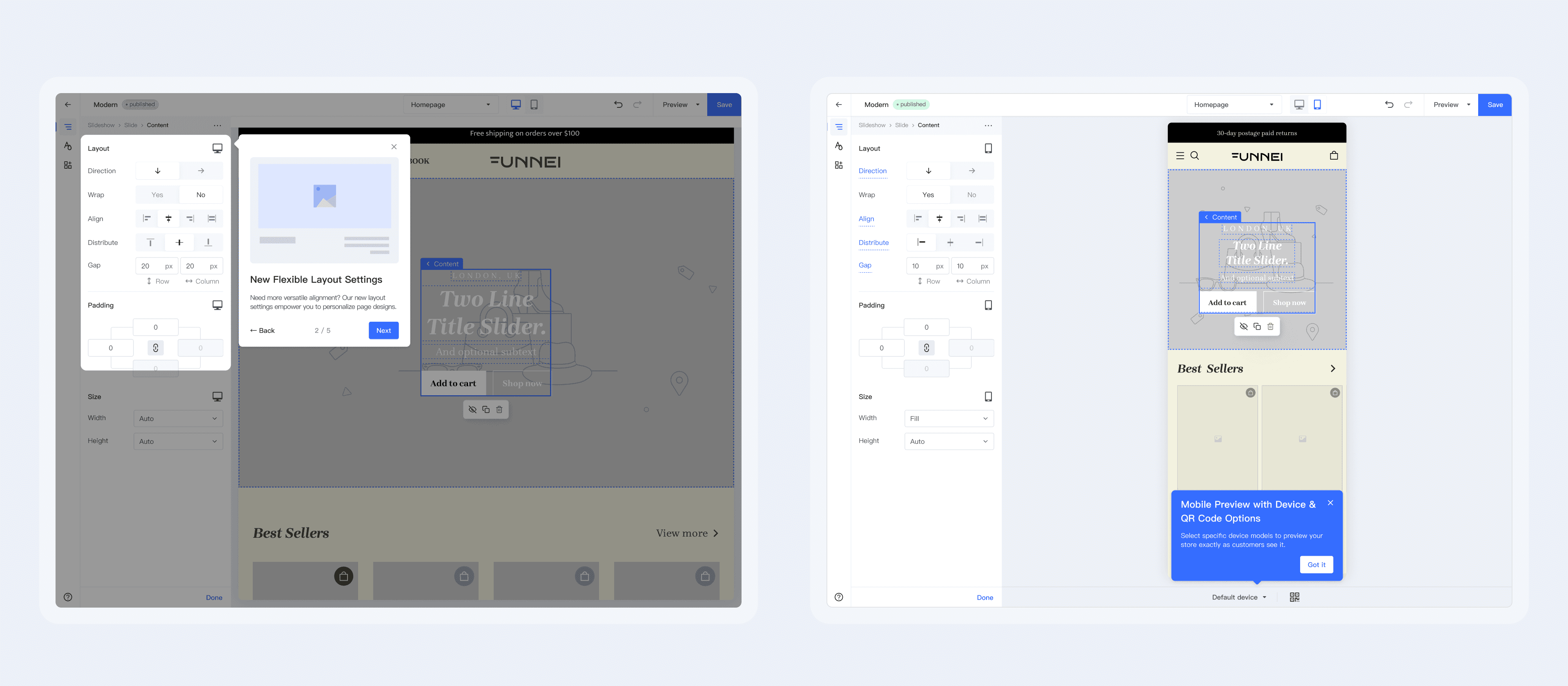
4. Progressive guidance and shared language
I structured guidance across onboarding, contextual prompts, and product-level updates. In parallel, I worked toward a more consistent vocabulary for high-frequency concepts, helping users build a clearer mental model over time.
Designing for product and engineering
A scalable experience depends on more than a strong final UI. I translated the new editing model into reusable design artifacts that could support implementation and future iteration.
My delivery focused on:
Reusable component definitions — clarifying component anatomy, configuration boundaries, and expected behavior.
Interaction states and edge cases — documenting how common editing actions, empty states, and responsive conditions should behave.
Consistent configuration logic — aligning similar controls and settings around shared interaction patterns.
Clearer design–development alignment — creating a common reference point for product, design, and engineering as the editor continued to evolve.
The goal was to give the team a foundation that was easier to build on—not just a redesigned set of screens.

Designing for product and engineering
A scalable experience depends on more than a strong final UI. I translated the new editing model into reusable design artifacts that could support implementation and future iteration.
My delivery focused on:
Reusable component definitions — clarifying component anatomy, configuration boundaries, and expected behavior.
Interaction states and edge cases — documenting how common editing actions, empty states, and responsive conditions should behave.
Consistent configuration logic — aligning similar controls and settings around shared interaction patterns.
Clearer design–development alignment — creating a common reference point for product, design, and engineering as the editor continued to evolve.
The goal was to give the team a foundation that was easier to build on—not just a redesigned set of screens.
What this enabled
The work created a more coherent foundation for the site-building experience:
A clearer model for understanding and composing page elements
More systematic patterns for configuration and responsive editing
A framework for layered product guidance and more consistent terminology
A reusable basis for future product and engineering iteration
Because the underlying structure was improved, future capabilities could be evaluated against a shared model rather than introduced as isolated additions.
Reflection
One important lesson was that structural clarity and content clarity need to evolve together. A more modular interaction model can introduce new concepts of its own, so the language, guidance, and naming around that model are part of the product experience—not an afterthought.
