
SAAS PLATFORM · UI/UX DESIGN
Designing a scalable property-management experience for small landlords
Project overview
Turning a fast-growing SaaS product into a clearer, more coherent system across landlord and tenant workflows.
Tools
Figma
Trello
Trello
Trello
Scope of Work
Context
This project focused on a pre-launch SaaS platform for small independent landlords.
As the product expanded, its workflows had become harder to navigate and less consistent across landlord and tenant experiences. The engagement began as a UX audit and grew into a practical product foundation: clearer information architecture, reusable layouts, a lightweight design system, and focused improvements to high-priority desktop and mobile workflows.
The goal was not to redesign every screen. It was to create a system that would help the product stay coherent as it continued to grow.
Business Challenge
The product supported a wide range of day-to-day rental-management tasks, but the experience had evolved feature by feature.
This created several challenges:
Important actions competed for attention on dense landlord screens.
Navigation, forms, loading states, and feedback patterns were inconsistent.
Related records were difficult to interpret across different areas of the product.
Desktop intent did not always translate cleanly to mobile.
New workflows risked adding more complexity without a shared design foundation.
The client needed a product direction that could improve beta readiness while remaining practical to implement in an existing application.
Product Goals
I aligned the work around four goals:
Help landlords understand what requires attention now.
Make complex records and status changes easier to scan and trust.
Prioritize tenant actions that are time-sensitive on mobile.
Establish reusable patterns so future features could extend the product without drifting visually or structurally.

Product Goals
I aligned the work around four goals:
Help landlords understand what requires attention now.
Make complex records and status changes easier to scan and trust.
Prioritize tenant actions that are time-sensitive on mobile.
Establish reusable patterns so future features could extend the product without drifting visually or structurally.
Discovery
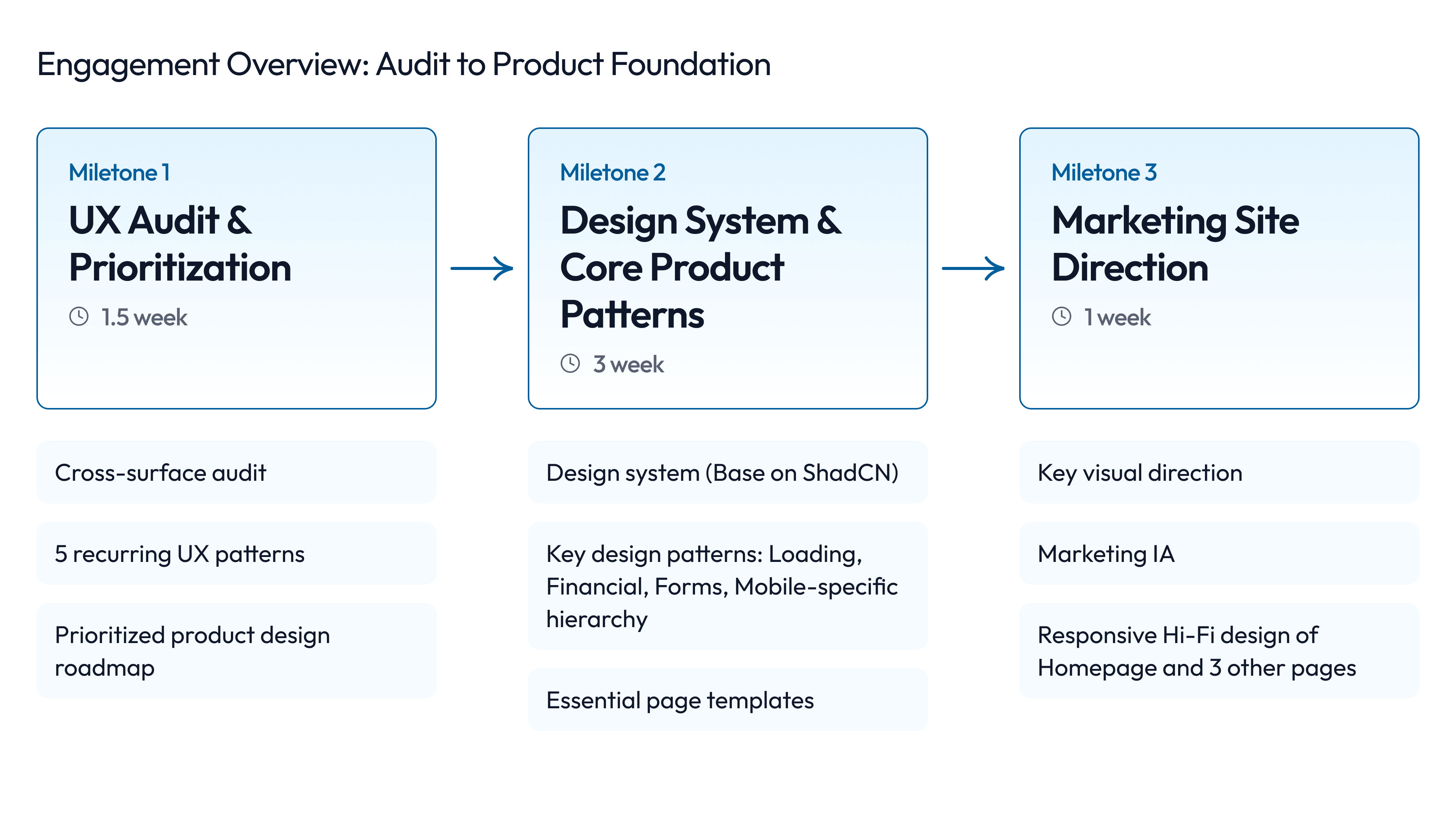
I began with a cross-surface UX audit across landlord, tenant, administrative, and public-facing experiences.
Rather than treating each finding as an isolated visual issue, I grouped the audit into a small set of repeatable product patterns:
System feedback and loading confidence
Form structure and validation clarity
Information hierarchy for dense workflows
Record structure and transaction semantics
Responsive behavior and mobile task prioritization
This reframed the engagement from a list of UI fixes into a prioritized product roadmap. It also gave the client and implementation team a shared language for deciding what to improve first.

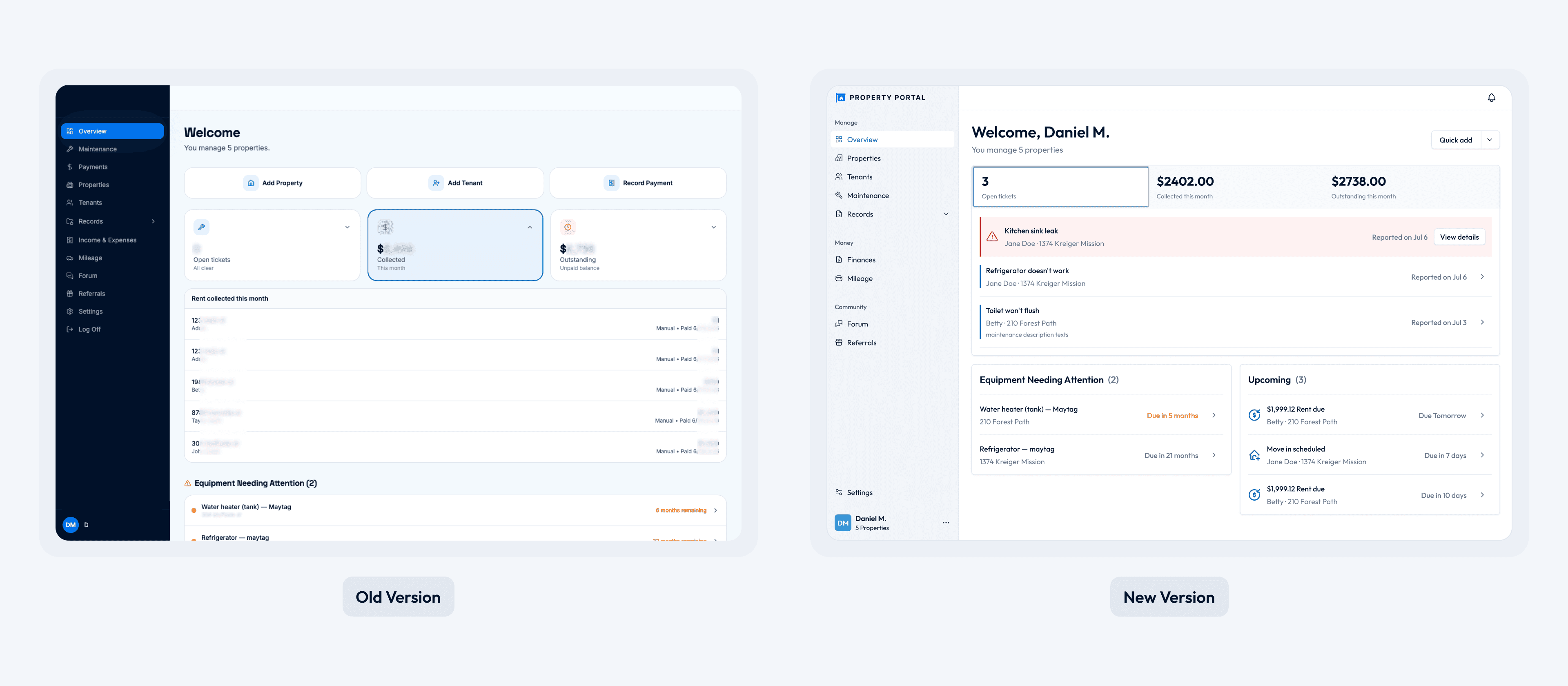
Before: Feature growth created a long, flat navigation structure.
After: Related tasks were grouped into clearer, task-based sections.
Key Workflows
Attention-first landlord dashboard
The dashboard was redesigned around urgency and decision-making.
Instead of giving every module equal visual weight, the layout separates immediate work, financial context, and lower-priority background information. This allows a landlord to quickly identify what needs action while still maintaining a reliable overview of the business.

Making financial records easier to interpret
Related financial records were consolidated into a clearer, more traceable model.
The redesigned structure distinguishes:
Transaction type
Category
Source
Associated context
This made records easier to scan, filter, and understand without forcing users
to reconstruct the meaning of each entry from separate parts of the product.

Reusable detail-page templates
I created a flexible detail-page framework that could support different entities without forcing each new page to be designed from scratch.
A stable page header, contextual status, primary actions, summary information, and related records create a familiar rhythm. The template can accommodate new fields and modules over time while preserving hierarchy.

Tenant mobile priority paths
The mobile experience was structured around the actions tenants are most likely to need in the moment: getting help, reporting an issue, reviewing information, and tracking the status of a request.
The design emphasizes clear calls to action, reduced cognitive load, and understandable progress states from submission through resolution.
Design Decisions
Several principles guided the work:
Attention is a hierarchy problem. Urgent work should be prominent; healthy background information should stay available without competing for focus.
States build trust. Loading, submission, success, and empty states are part of the product experience, not implementation details.
Context reduces errors. Status, source, and related information should appear where users make decisions.
Mobile is task-first. Responsive design should preserve intent, not simply compress desktop layouts.
Patterns should anticipate growth. Reusable structures must leave room for future content and workflows.


System Design
I created a lightweight design system direction designed for adoption within an existing product.
It included:
Typography, spacing, color, elevation, radius, and responsive rules
Navigation and page-header patterns
Buttons, badges, forms, dialogs, and feedback states
Loading skeletons, empty states, and status treatment
Data rows, filters, tables, and contextual labels
Mobile touch targets, sheets, and responsive data patterns
The system was intentionally practical rather than overly theoretical: each pattern was documented through real product use cases so the client could continue building consistently after handoff.
Business Outcomes
The project turned a broad set of interface improvements into a clearer product foundation.
The final handoff included:
A prioritized audit and beta-readiness roadmap
A reusable design-system foundation
A clearer landlord dashboard and detail-page structure
Improved information architecture for complex records
Focused tenant mobile workflows
Implementation notes and pattern guidance for future development
The client described the outcome as a system that would carry the product forward, rather than a collection of isolated screens.

